In web design there is always a time where we have to decide the dimensions of our web page but which are the correct dimensions? In which criteria do we choose these proportions?“Decision based in Instinct is memory in disguise”.
Proportions that recurring in books for centuries, are chosen based in mathematics and the arts! Pages created based on geometric figures and numbers such as φ (golden ratio) or π and the diatonic scale for music it is proven to actually be more pleasant to the eye or to someone’s mind.
Sizing, spacing and intervals used in the same way they used to music or in a painting to fill up the empty space, are based on a more general pattern used in nature. As shapes that can be found in nature seem to make more sense to our perception the same thing also apply when creating the layout of a web page. Emotions can be derived from and be driven by a page’s ‘geometry’.
The Golden Ratio example
The theory: Two quantities are in the golden ratio if, the ratio of the sum of the quantities to the larger quantity is equal to the ratio of the larger quantity to the smaller one.
It is also proven that the small quantity is always the 38.2% and the large one is the 61.8% of the whole (Just divide 10 with φ, 10/1,618 = 6,18). If for example we had a straight line with width of 10px, it applies: 10/6.18 = 6.18/3.82 = φ ≈ 1,618
The Golden Ratio is almost everywhere in nature. We can also find the Golden ratio in the Fibonacci series (a series of numbers where the sum of the preceding numbers gives us the next number).The division of two of these consecutive numbers tends to φ ≈ 1,618. Some of the widely used ratios for pages, such as 2:3, it actually gives us the φ number and is part of the Fibonacci sequence (0,1,1,2,3,5,8…).
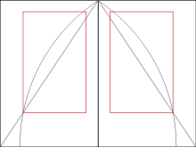
Tschichold, by whom the laws of form of book page construction was popularized in the mid of 20th century, based his theory of the page proportions in the Golden Ratio (using mainly 2:3 proportions).
More widely used proportions are also:
• 1 : φ
• 1 : √2 (the ratio of A3, A4, A5 paper, etc.)
φ in web pages
In the same way that these rules apply in books, they also apply in web pages. You could create for example a pleasant web page divided in the already known sections (header,menu,main content,sidebar,footer) based in these analogies.
For example if you divide the width of your page with φ, you can use the result as the size of the main content area and the rest as the size of your sidebar which is the same as the analogy we saw previously, 61, 8% – 38, 2%.
You can also apply this rule to the width of other elements for finding their height (width/φ = height).
Who said mathematics aren’t useful..?
You can read more about harmony in typography here.


