Psychological factors and facts.
Although, colors can affect people in many ways, the psychological responses to specific colors can be based in a person’s culture or individual experiences. This means that not all people will have the same react in the sight of a specific color. Nevertheless, there are, objectively speaking, bad and good color combinations and there are certainly large groups of people, even entire generations or cultures that seem to have similar reactions to colors. Either way a web designer must be familiar with the color theory in order to get the maximum results out of his work.
Colors and their symbolism
Although there are bad color combinations, there aren’t bad or wrong colors to use. It’s all about harmony – how you combine them. Before talking about color combinations though, maybe it would be good to know some things about each color. Let’s examine some of the most basic colors more closely
1) White
It is the color of light,the color of perfection and purity. White color is also associated with the meaning of ‘clean’. That’s why in commercials people use white color for advertising cleaning products.
2) Blue
Blue symbolizes openness, intelligence, and faith. It also conveys a sense of stability and clarity. Psychologists say that it calms people and also reduce appetite probably due to blue’s lack of existence in real food. You’ll never going to see food commercials based in this color but you probably going to see it in airline or sea companies as it is the color of the sky and the sea.
3) Orange
Quite a calm color often associated with happiness, enthusiasm and creativity. It is said that orange can also stimulate appetite and this is why it is used by food companies around the world to promote food products. As not being the most “severe” color around, it is also often used by companies based on more “informational” purposes.
4) Red
As being a very active color, red is used as a symbol of guilt, anger, or blood. It has also a reputation for stimulating adrenaline and blood pressure and it is also the color of the passion.
5) Yellow
A highly active and visible color, yellow is mostly used for declaring danger and in caution signs. It is also associated with energy and it has the reputation of getting people angry!
6) Green
The color of nature. It symbolizes growth, freshness, and hope. An also calm color, Green is also associated with regeneration, fertility and rebirth for its connections to nature.
7) Black
Although black color is often associated with evil (as the opposite of light or white) it can also be used to symbolize power, elegance, and strength.
Colors can also be divided to ‘warm’ or ‘cool’ colors. Basically this is also based in our stimulations from nature. For example red or yellow are considered to be warm colors and this is natural if we think the color of the sun, while blue it’s considered to be a cool color.
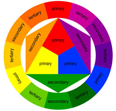
Traditional Color Wheel
Color Combinations – Schemes
In the web, colors are displayed in percentages of red, green, and blue(RGB). Although there are more than one “color wheels” and color theories, we are going to examine the traditional red-yellow-blue wheel which is used for more than 2 centuries.
Colors are divided in primary, secondary and tertiary.
In the traditional wheel , Red, Yellow and Blue are considered to be the primary colors. Every fourth color from one primary color in the wheel is another primary, two neighboring primary colors mixed are creating secondary colors and a primary color mixed with a neighboring secondary color creates a tertiary color.
Based on this wheel, there are about 6 ‘formulas’ (schemes) to create good combinations of colors and we are going to examine every last one of them.
Monochromatic – Analogus
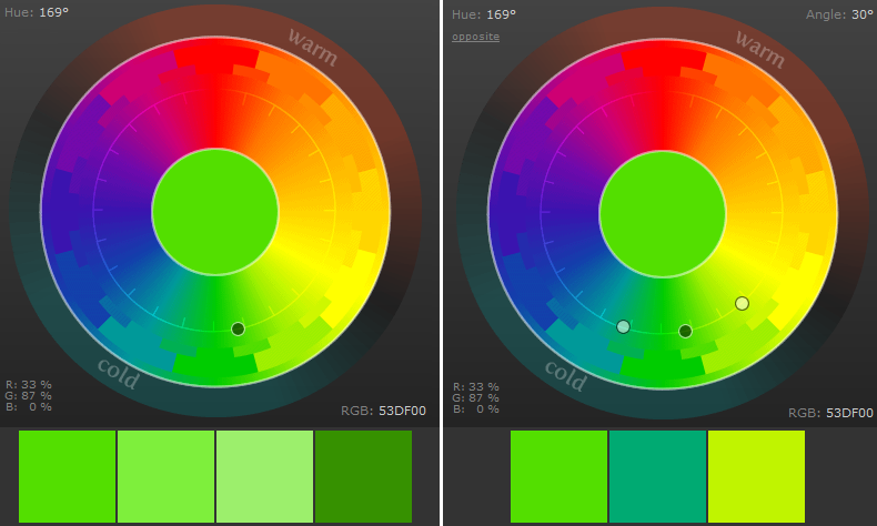
1) The Monochromatic Color Scheme
This scheme is based in the use of a single base color and in any number of variations of it.
2) The Analogous Color Scheme
The analogous color scheme consists neighboring colors.
In the color wheel usually in an amount less than 1/3 of the wheel
Complementary – Split Complementary
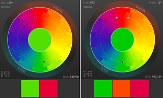
3) The Complementary Color Scheme
A complementary color scheme consists of opposite colors in the color wheel (ex. green-red).Note! Never use colors of the complementary scheme together in roles of background-foreground. The colors create an effect known as simultaneous contrastwhere each color makes the other appear more vibrant and dominant.
4) The Split-Complementary Color Scheme
The split-complementary scheme uses a color and the two colors adjacent to its complementary.
Triadic – Tetradic
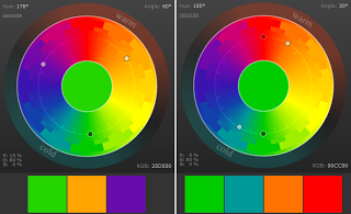
5) The Triadic Color Scheme
In the triadic scheme we divide the color wheel into thirds,
Meaning that the colors are equally spaced
6) The Tetradic Color Scheme
A tetradic color scheme is one in which any complementary color scheme is combined with another complementary color scheme
Using any of these schemes is an assurance that you are using the right color combinations and that you are not going to drive your visitors away by just looking at your web page.It is safe to use any combination based on the above rules otherwise especially if you are new to these things, you probably are going to get things messed up… a lot..!


